DESIGN-WORK/BRAND-IDENTITY/SOUPER-JENNY
Souper Jenny
ABOUT PROJECT
The following rebrand will implement cohesive designs across all 5 locations for a unified, lasting impression. It will develop a strong brand system reflecting the principles of community, sustainability, and health, while appealing to a younger audience and retaining current customers.
ACCOMPLISHED
Brand Identity | Brand Strategy | Messaging | Print | Advertising
INDUSTRY
Food
Maritza Quintuna (Principal/Art Director) | Ava Neary (Senior Designer) | Rory Young (Junior Designer) | Kenzie Grieger (Production Designer) | Brandly Gilyard (Secretary/Social Media)
TEAM MEMBERS
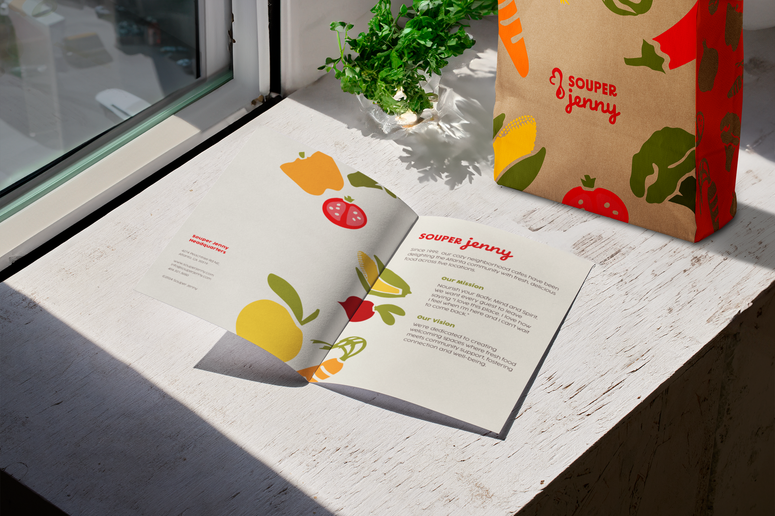
We created a logo reflecting Souper and Spoon, maintaining the iconic red color while refreshing the design. A warm color palette highlighted the brand’s values, with typography reflecting the founder’s personality with mister brown just for the brand’s logo. We prioritized sustainability, using the Cocogoose Protrail font for clarity.
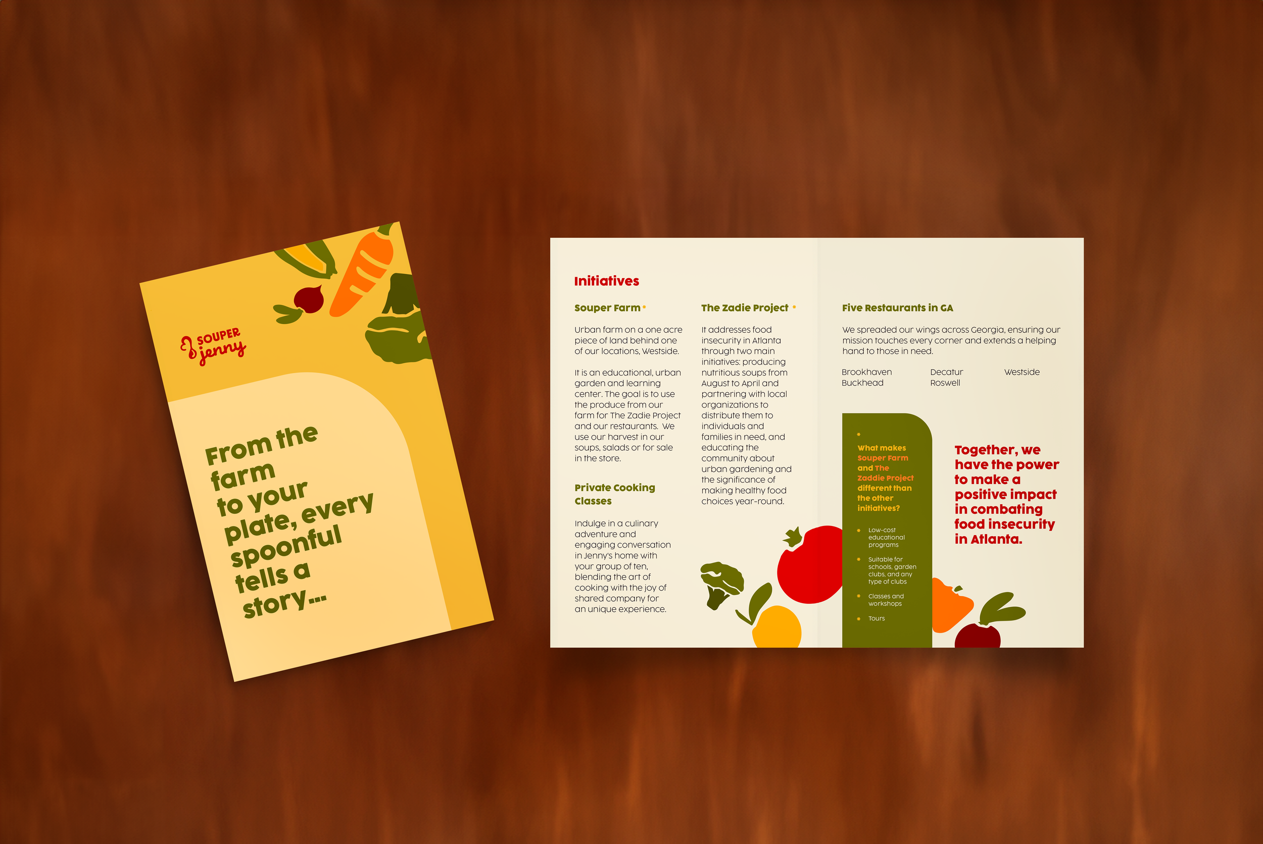
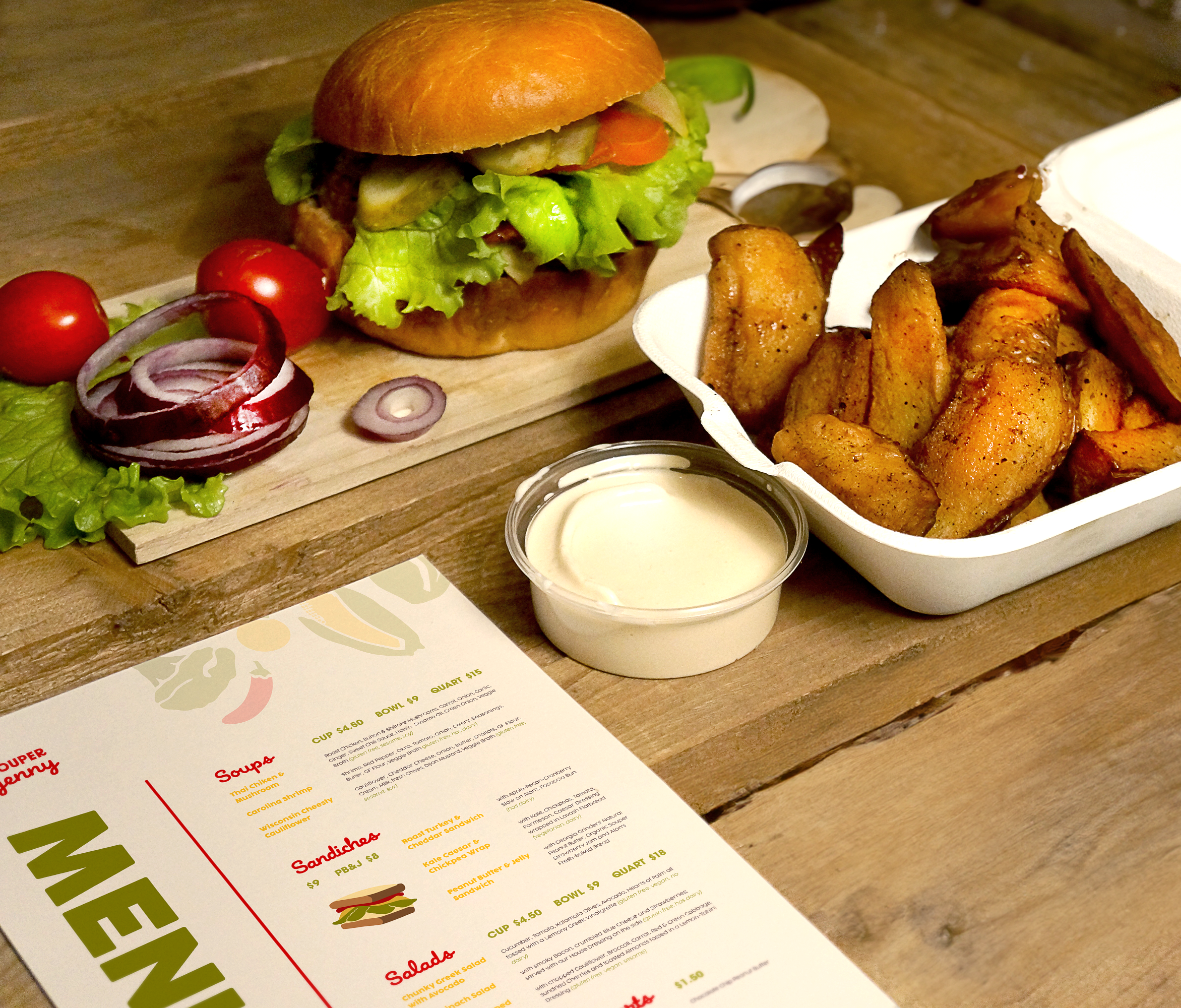
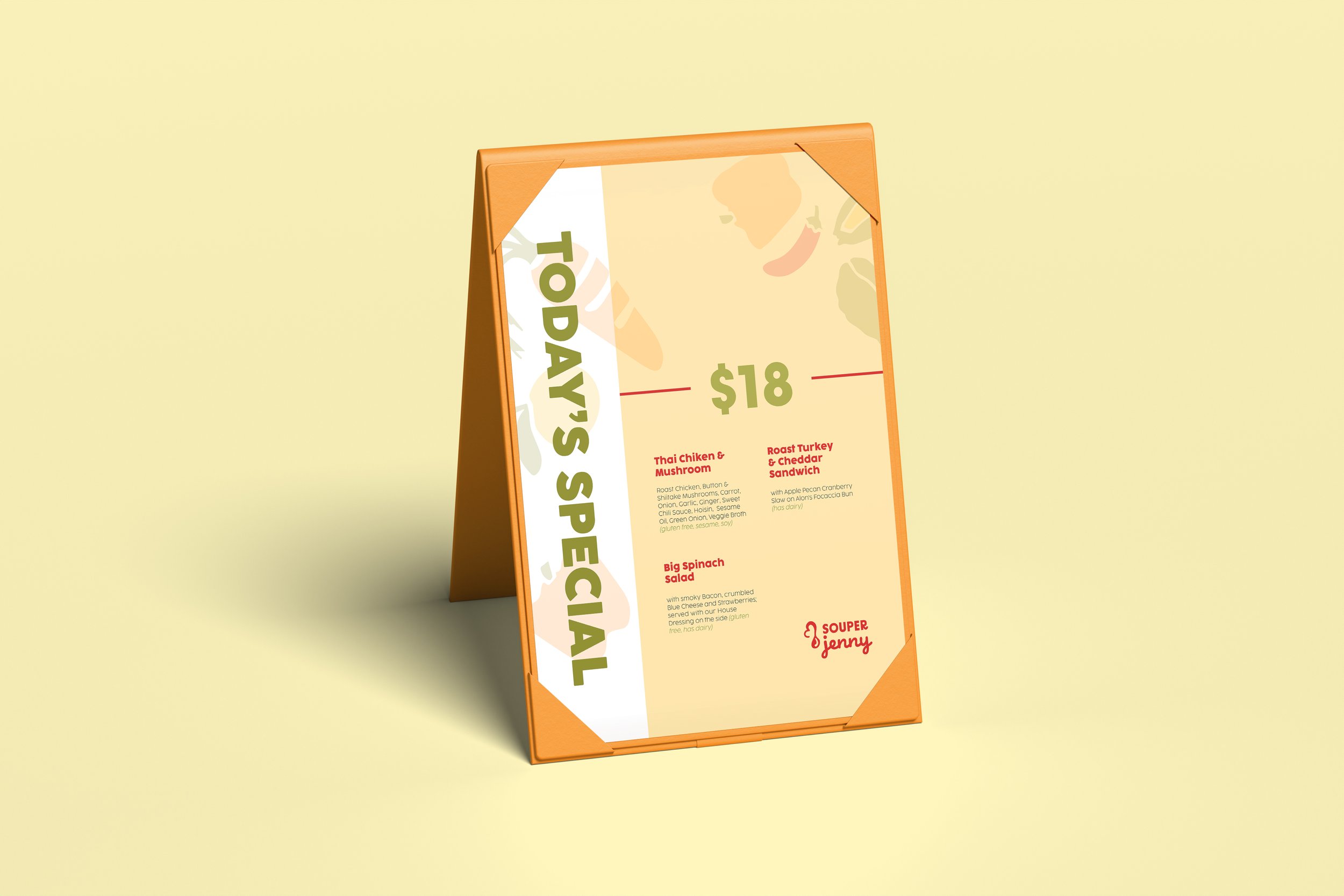
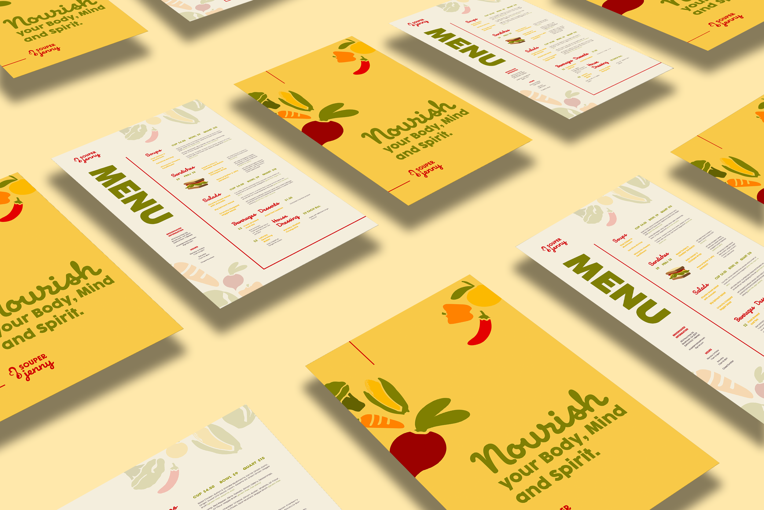
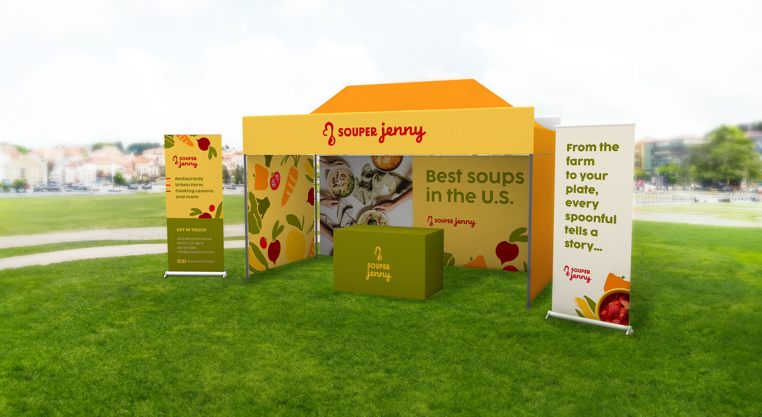
Souper Jenny Rebrand was enhanced through a unified brand strategy that brought together new visitors while retaining existing customers through sustainable design.
The new design honored the owner’s vision, Jenny Levinson, about sustainability and healthy habits, serving Atlanta community since 1999.

