DESIGN-WORK/MARKETING/ALLIANCE-FARMERS-MARKET
Alliance Farmers Market
ABOUT PROJECT
The goal of this project was to establish a strategic marketing system that would create a cohesive brand identity, improve accessibility, and foster a strong sense of community for the Alliance Farmers Market. By leveraging creative strategy and data-driven decision-making, the initiative sought to create a lasting impact on vendors, customers, and the local community.
ACCOMPLISHED
Re-Brand Identity | Brand Strategy | Visual Identity | Wayfinding | Social Media | Content Development | Advertising | Marketing
INDUSTRY
Agriculture
TIME FRAME
2022-2023
LOCATION
Bridgeport, CT

WHO ARE THEY?
Alliance Farmers Market
Addresses insufficient access to fresh and affordable fruits and vegetables for individuals working and residing in USDA designated food desert.
MARKETING ANALYSIS
5.27.24
-
2022: The farmers market had no developed branding and minimal digital assets, with only a single-page format and two graphics. It required a highly strategic approach to launch the market in a short window of time, one month.
-
The 3 target audiences faced distinct challenges:
Farmers and Vendors
Struggle: Limited visibility and inconsistent customer traffic made it challenging to support the market. Additionally, there was a lack of recognition for the farmers' hard work and dedication in bringing their goods to the market..
Low-Income Families
Struggle: Difficulty accessing fresh, affordable produce due to barriers like limited transportation and lack of awareness about available resources, requiring clear, relatable messaging..
Corporate Employees
Struggle: Time constraints and lack of awareness, making it hard for them to visit the market without time-specific messaging that fit into their busy schedules.
BRAND STRATEGIES
-
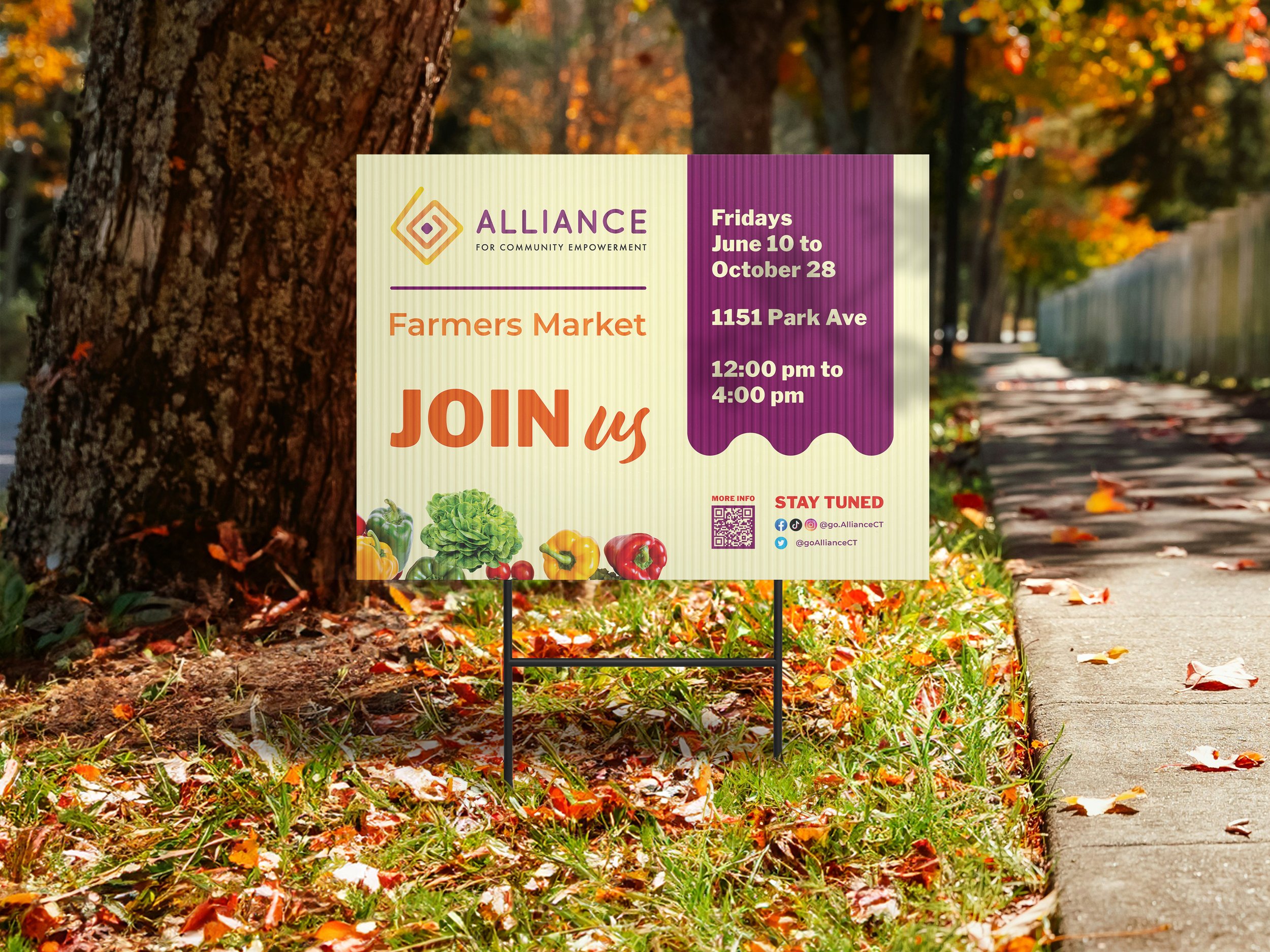
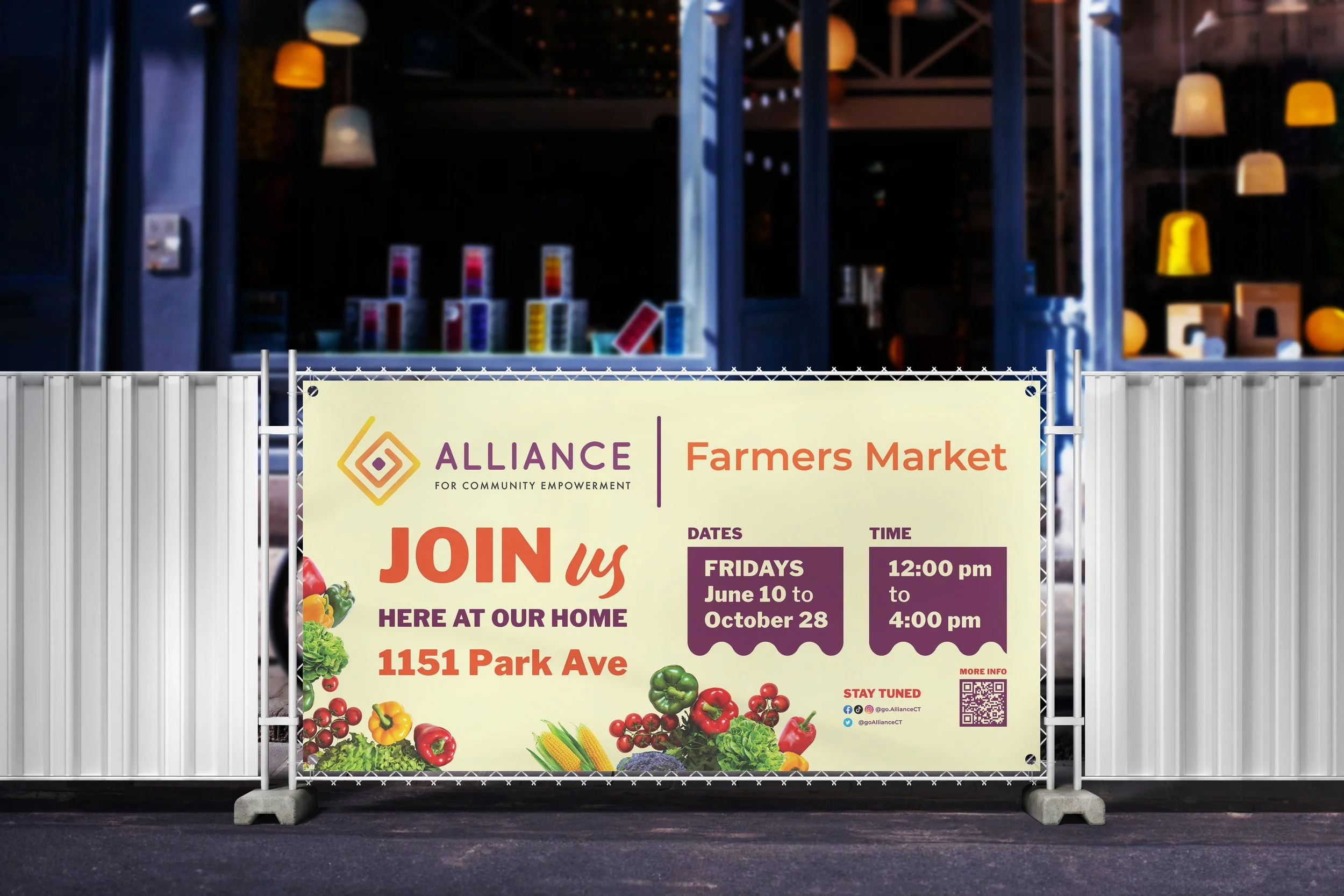
Solution: Within one month, a cohesive branding suite was rapidly developed to align seamlessly with the parent organization’s style. This included flyers, banners, street signs, and social media assets, providing an efficient and streamlined approach.
The primary focus was on establishing consistency and enhancing brand awareness.
Impact: This strong foundation paved the way for a successful market launch in June, resulting in $8,147 in vendor sales for the 9 days the market was opened.
-
Solution: Recognizing the potential for growth, a $1,000 budget was implemented 5 key strategies were implemented to enhance engagement, accountability and return of investment:
Rebranding: A cohesive and strategically designed brand identity was implemented to ensure seamless consistency across all digital and physical touchpoints. The vibrant yellow palette and unified visual framework reinforced strong brand recognition and memorability for the market.
.
Website Development: A dedicated website was launched to improve accessibility for all stakeholders, featuring vendor information, schedules, and a user-friendly interface to streamlining information.
.
Community-Centered Content: Authentic storytelling strengthened connections with the market’s diverse audiences, fostering trust and loyalty. By focusing on legacy, the farm-to-table experience, and farmers’ dedication, the content inspired a deeper appreciation for the market’s role in the community.
.
Cost Efficiency: Created banners and street signs with replaceable vinyl lettering so future updates (e.g., market details) could be made by simply printing and applying new letters.
.
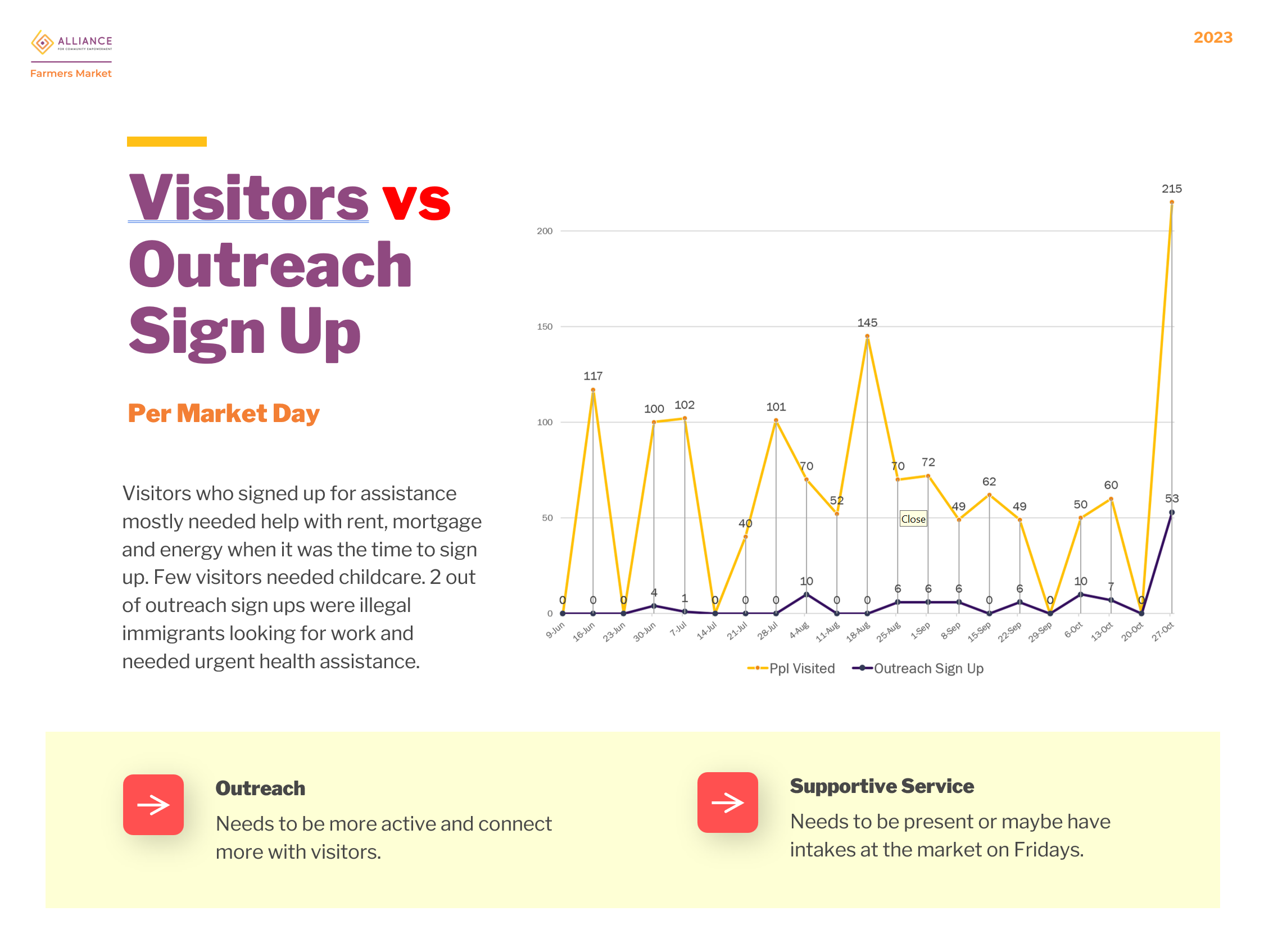
Data-Driven Adjustments: Surveys were distributed, and continuous data collection processes were established to understand target audience behavior, preferences, and needs. These insights informed decisions, ensuring strategies were effective and relevant.
Impact: The results were remarkable. For 16 days, vendor sales had tripled to $22,263. The rebranding created a strong visual identity, making the market easily recognizable to the community. The thoughtful design of print assets saved future costs, reflecting the project’s long-term, scalable mindset.
Brand Evolution
2021
Market pilot with this brand.
2022
Building the foundation.
-
Given the tight one-month timeframe for the project launch, it was crucial to prioritize vendor acquisitions while gradually developing the brand. As a result, the brand's aesthetics were aligned with the existing brand identity throughout the year.
2023
Scaling for sustainability
-
The color palette set the tone for the market’s identity. By drawing directly from the main brand’s logo, the palette maintained consistency while carving out a distinct identity for the market. Bright yellow hues took center stage, radiating excitement and capturing the market’s vibrant energy. The bold purples and oranges created a balanced hierarchy.
This warm and dynamic combination wasn’t just visually striking—it created a welcoming atmosphere where interactions flourished.


